Category Archive: Design

iPhone Photography

North Dakota is one of my favorite places to visit. Everytime I go back, I always see the most beautiful trees, wildlife and scenery. I ended up taking a few pictures and this was my result. And yes, they are both taken with and edited with my iPhone!

North Dakota iPhone Photography

Massimo Vignelli Typographic Poster

Per the passing of the Grandfather of Graphic Design, Massimo Vignelli, I decided to make a typographic poster of one of my favorite quotes by him.

The full quote is actually “The life of a designer is a life of fight. Fight against the ugliness. Just like a doctor fights against disease. For us, the visual disease is what we have around, and what we try to do is cure it somehow with design”.

Hope you enjoy!

MASSIMO

Just Smile

A daily reminder for all of us. An image I made for fun involving photo editing and messing around with photoshop.

tumblr_inline_n1iqlg5V5b1qb220t

Illustrated chalkboard invitations

I just made these awesome invitations (which you’ll find in my portfolio) where I used Kelly Sorensen’s illustrated flowers.

Untitled-2

Magicland photo manipulation

I am working on a poster for my college’s alumni poster show. What do you think of the one I made so far? What things should I add or do to it?
Screen Shot 2014-05-01 at 9.36.36 AM

Love is Sweet Chalkboard sign

Check out this “Love is Sweet” chalkboard sign I designed in Photoshop for a friend’s wedding. (The candy bar picture is not mine :)
562ccfc68209a79c0a7a32f9ee472d5a copy

Colorful Duotone Photoshop Tutorial

Check out this Photoshop tutorial that I found pretty awesome. I added my own things to it but the beauty of this tutorial, you can adjust everything to make it original and your own.

http://blog.spoongraphics.co.uk/tutorials/how-to-create-a-colorful-fluoro-pop-art-photo-effect

After all the steps, I added this background below the bokeh layer and put it on Hard Light at 50%

grunge background with copy space for your text

Once you do that, I added a contrast and brightness adjustment layer to the very top. The values I used are -47 for brightness and 53 for contrast.

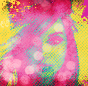
You can adjust anything on here but this is my result:

Screen Shot 2014-03-27 at 2.06.55 PM


ENJOY!


Converse Photography

As I was lingering into college, I had no idea what I wanted to major in. As I started dabbling in core classes, it hit me I wanted to be a photographer. That didn’t pan out but I still enjoy taking photos of anything and everything that amuses me. Like my new chucks that are my favorite color.

Converse Photography

The Secret Garden Branding

6e145e9e0eba7046303096bd62906799

Absolutely love this branding and design of The Secret Garden Inn, in Cape Cod. The vintage look and every detail from the postcards, business cards and colored edges, make you want to stay there even more.